Login
Log in if you have an account
Register
Having an account with us will allow you to check out faster in the future, store multiple addresses, view and track your orders in your account, and more.
Create an accountChoosing your frame

TOP THREE THINGS TO THINK ABOUT WHEN CHOOSING YOUR FRAME:
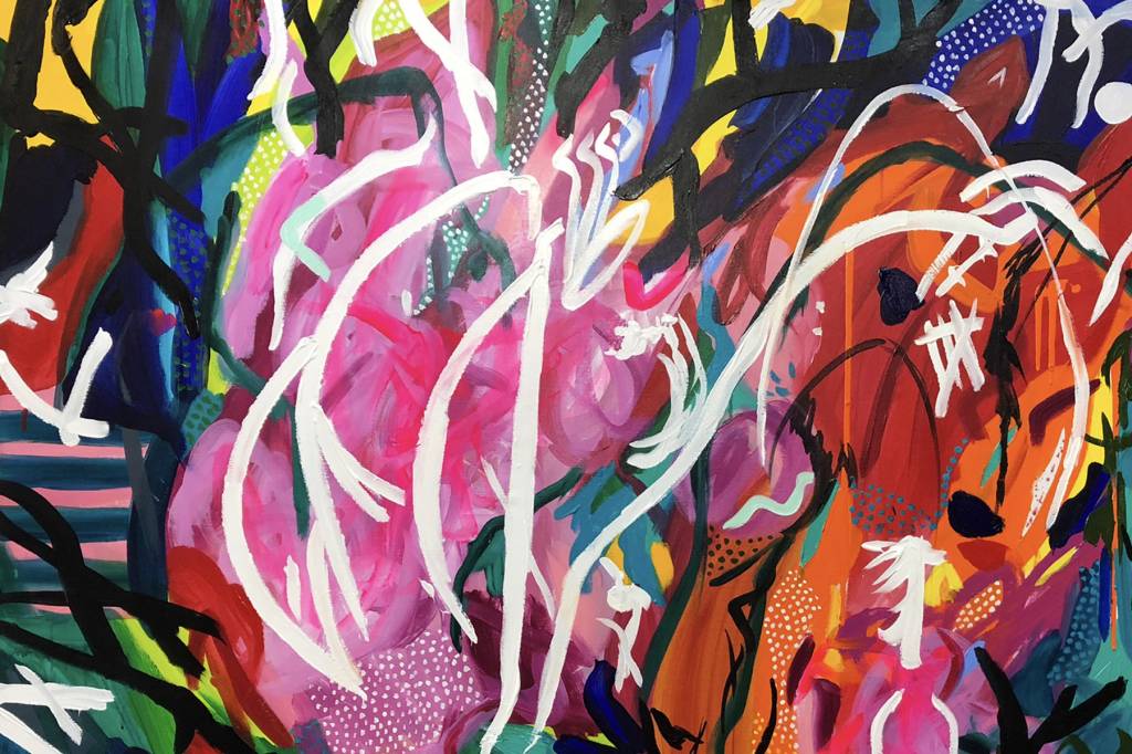
1. Consider the materials, method and medium of the work.
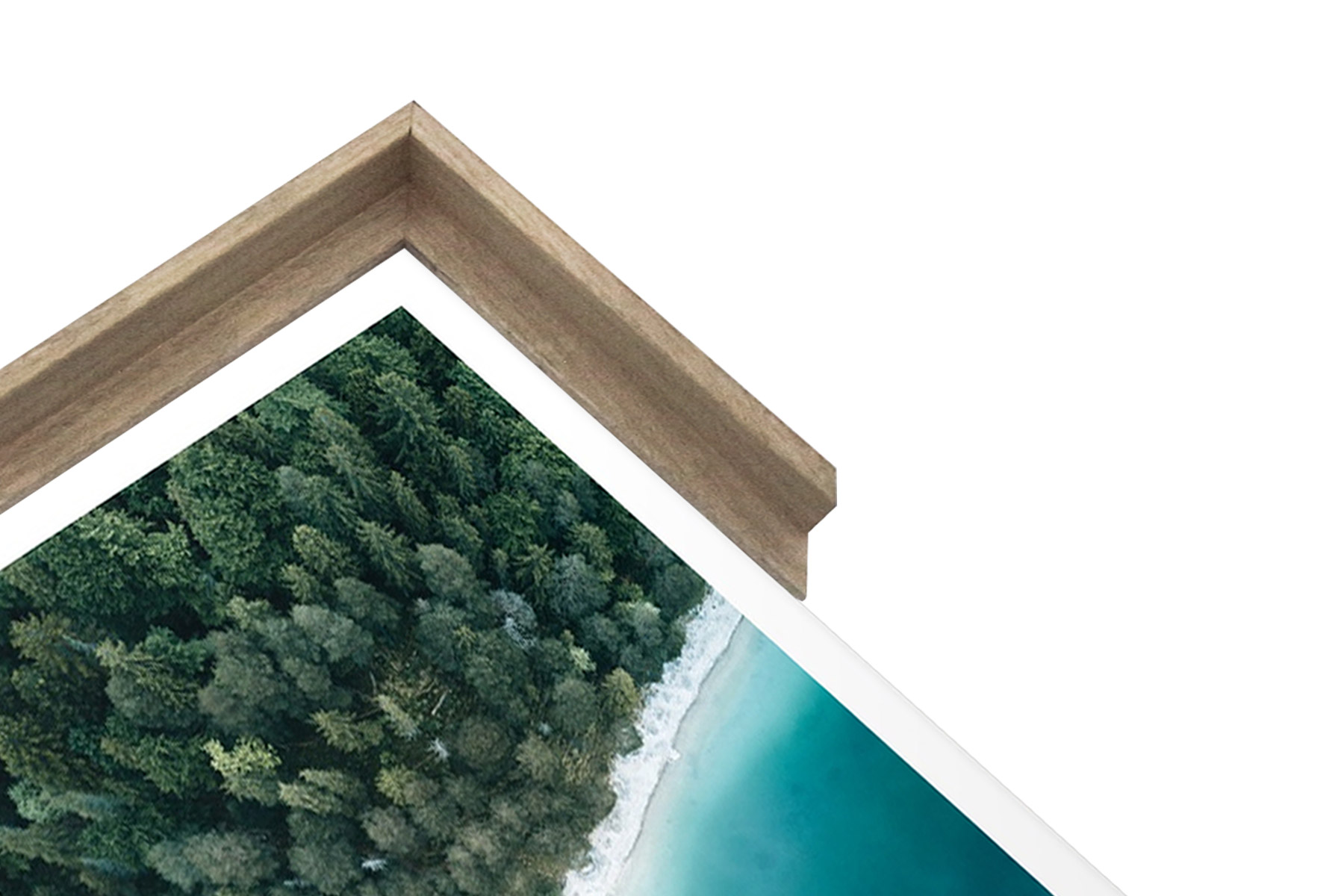
Depending on whether it is a poster, print or photograph a painting or drawing; different materials, methods and mediums will have been used that create the desired aesthetic. Photography is often enhanced with a simple black or white frame in order to highlight the subject matter and not draw focus from the work. If the artist has used pencil, charcoal, pastel or watercolour; a raw oak frame is often favourable to give to the work a natural, rustic look. The simplicity of the oak paired with the stark white matt creates an air of sophistication- a good option if you want to elevate your piece but keep it minimal. For bold and striking works, a glossy black frame is good option to make a statement, without pulling focus.
2. Consider the interior space you are displaying the work in.
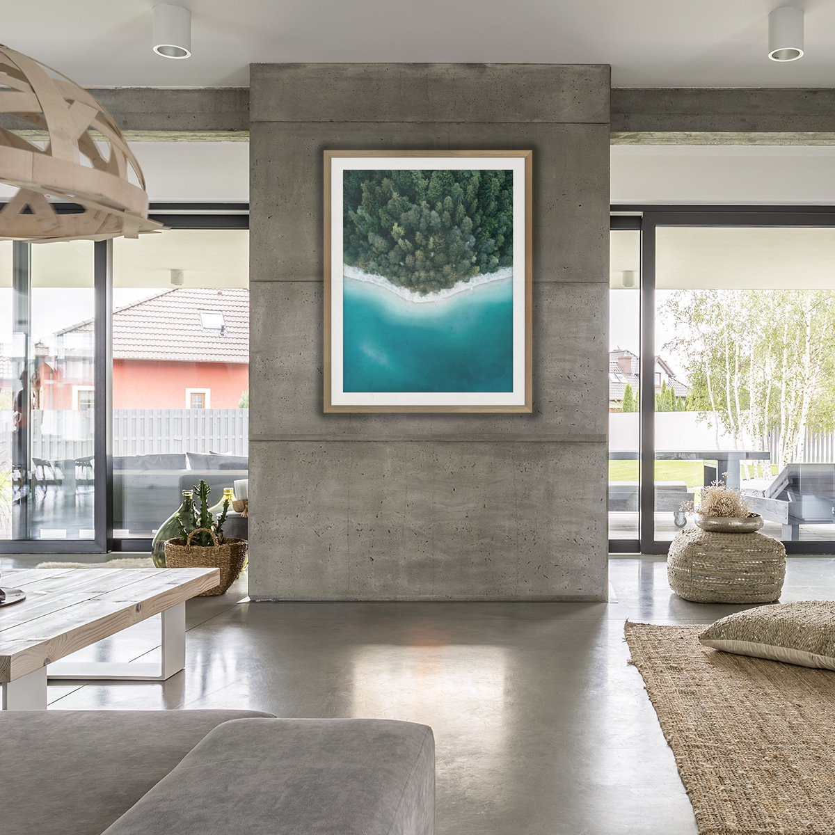
The space you choose to hang your work is equally as important as the frame you choose. Consider the Room you are hanging it in, the wall space, the existing decor in the space and the colour pallet. This all depends on your own personal style and the atmosphere you want to create. If your space is contemporary or industrial, a black, white or bold coloured frame can work well. If your home is more rustic or bohemian in style, a raw oak frame will work well to compliment the natural and earthy tones. If your house is quite eclectic and sporadic, consider the existing furniture and features in the space, ensuring the frame isn’t overwhelming.
3. Consider the overall aesthetic you are trying to achieve.
The frame you choose can completely change the look of your piece. Think about what you feel, or what you want other people to feel when viewing the work. Do you want it to be bold, dynamic and striking or more subdued and tranquil. Depending on the frame and colour pallet, the piece can be a dominant feature that livens up your space and provokes discussion. Alternatively, you may desire the piece to be an edition to the space, subtly complimenting its existing surroundings. Black frames as well as bold coloured frames tend to me more harsh and dramatic, confining your piece and drawing the eye immediately to the work. In contrast to this, white frames and raw oak frames enable the work to be viewed in a less apparent manner, providing a gestural focus to the piece.
— For all enquiries contact us today on 03 8596 2250, or Come in store and speak with our friendly and qualified team, to help you choose the right frame for you piece —
Recent articles
View all
International Womens Day Art Exhibition

Christmas specials at Guggenart